Facebook announced today that it is having a ‘spring clean’ of the ‘news feed’ part of the network. This short video explains a bit about why:
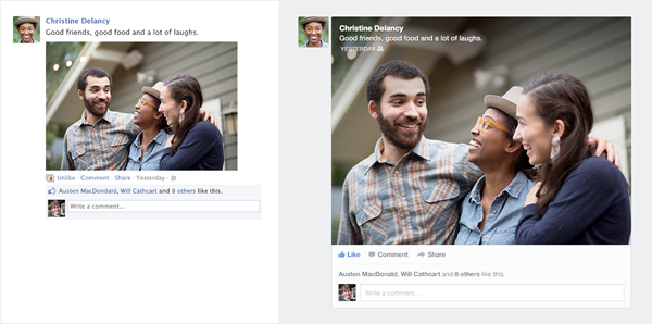
The new design has a lot more white space and happens to look an awful lot like Google+! I predicted last year that images were going to be the big deal in Social Media in 2012. This is looking like having no signs of abating. Want to get a status update noticed on Facebook? Add a picture. Seriously.
This time, the revamp looks great, not a million miles from what it’s currently like but definitely a lot easier on the eye. I’m hoping, therefore, that this won’t release the avalanche of complaints from the launch of the new timeline back in Autumn 2011. There is also a much better focus on making the platform work well on mobile devices.
What do you think of the new look? If you like it, you can sign up here to be one of the first to get the new look.